Data Visualization Platforms simplify the process of understanding complex data by converting it into visual representations like charts and graphs. These tools make data more accessible to everyone, speeding up decision-making and improving comprehension. Businesses using data visualization report increased efficiency and better strategic planning. In today’s data-rich environment, visualizing data is essential for making sense of information and driving informed decisions.
The visual appeal not only aids in deeper understanding but also expedites the identification of patterns and trends within the data. Businesses that embrace data visualization experience heightened efficiency, faster decision cycles, and enhanced strategic planning capabilities. In today’s data-driven landscape, the transformative impact of visualized data is indispensable for navigating complexities and driving informed decisions.
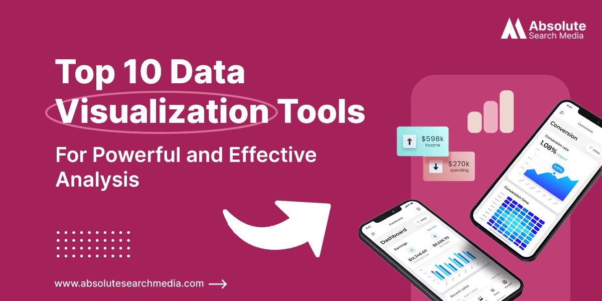
What Are Data Visualization Tools?
Data visualization tools are software applications or platforms that convert raw data into visual representations such as charts, graphs, maps, and dashboards. They empower users to explore, analyze, and present data in a more intuitive format. With various features, users can customize visualizations, conduct advanced analysis, and share insights.
These tools are utilized across industries to uncover patterns, trends, and relationships in data, aiding decision-making and problem-solving. They play a critical role in enabling stakeholders to make informed decisions, identify opportunities, and effectively communicate insights.
From marketing analytics to financial reporting, data visualization tools enhance industry importance by providing a visual narrative that helps organizations extract actionable intelligence from complex datasets, driving strategic success in the data-driven era.
Check out this intriguing list of data visualization tools, which are software applications or platforms specifically designed to convert raw data into visually engaging representations:
Top Data Visualization Tools
1. Tableau: Tableau is a leading data visualization software that empowers users to create interactive and visually compelling dashboards, reports, and visualizations. Here are some of its pros and cons.
Pros:
- User-Friendly Interface: Tableau offers an intuitive drag-and-drop interface, making it accessible to users with varying levels of technical expertise.
- Wide Range of Visualization Options: With Tableau, users can create a diverse range of visualizations, including charts, graphs, maps, and dashboards, to effectively communicate insights.
- Interactivity: Tableau visualizations are highly interactive, allowing users to explore data, drill down into details, and filter information dynamically.
- Integration: Tableau seamlessly integrates with a variety of data sources, including databases, spreadsheets, cloud services, and big data platforms, enabling users to analyze data from multiple sources in one place.
- Scalability: Tableau is designed to handle large volumes of data and can scale to accommodate growing datasets and user bases.
- Community Support: Tableau has a vibrant and active user community, providing access to resources, forums, and knowledge sharing to help users learn and troubleshoot issues.
Cons:
- Cost: Tableau can be expensive, particularly for organizations requiring multiple licenses or advanced features. The cost may be prohibitive for smaller businesses or individuals.
- Learning Curve: While Tableau’s interface is user-friendly, mastering its full capabilities may require some time and training, especially for complex analyses and advanced features.
2. Looker: Looker is a data analytics and business intelligence platform that enables organizations to explore, analyze, and visualize their data in a user-friendly interface. Here are some of its pros and cons:
Pros:
- Powerful Data Modeling: Looker’s data modeling capabilities allow users to create and customize data models to suit their specific needs, providing flexibility and scalability.
- Collaborative Environment: It fosters collaboration among teams with features like shared data models, collaborative dashboards, and real-time data exploration.
- Data Visualization: Looker offers a variety of visualization options, including charts, graphs, and dashboards, to help users gain insights from their data quickly and easily.
- Embedded Analytics: It allows organizations to embed data visualizations and dashboards directly into their applications or websites, enabling seamless integration with existing workflows.
- Customization: Looker offers extensive customization options, allowing users to tailor the platform to their specific requirements, including custom metrics, dimensions, and filters.
Cons:
- Limited Native Integrations: While Looker offers integrations with various third-party tools and platforms, its native integrations may be limited compared to other BI solutions, requiring additional development effort for seamless integration with existing systems.
- Performance: Some users report performance issues with Looker, particularly when dealing with large datasets or complex queries, leading to slower response times and reduced usability.
3. Zoho Analytics: Zoho Analytics is a robust business intelligence and data analytics platform that offers a wide range of features for data visualization, reporting, and analysis. Here are its pros and cons:
Pros:
- User-friendly Interface: Zoho Analytics provides an intuitive and user-friendly interface, making it easy for users to create and customize reports and dashboards without extensive technical expertise.
- Customizable Dashboards: Users can create customizable dashboards with drag-and-drop functionality, enabling them to visualize key metrics and KPIs in a visually appealing and interactive format.
- Advanced Analytics: Zoho Analytics offers advanced analytics capabilities, including predictive analytics, machine learning, and AI-powered insights, empowering users to uncover deeper insights and make data-driven decisions.
- Collaboration Features: It provides collaboration features such as data sharing, commenting, and version control, facilitating collaboration among team members and stakeholders on data analysis projects.
- Affordable Pricing: It offers flexible pricing plans with affordable options for businesses of all sizes, including a free plan with limited features and paid plans with additional functionalities.
Cons:
- Integration Limitations: While Zoho Analytics supports a wide range of data sources, some users may find limitations in terms of integration with certain third-party applications or services.
- Limited Customization Options: Some users may find the customization options for visualizations and dashboards to be somewhat limited compared to other advanced BI tools.
4. Sisense: Sisense is a business intelligence and data analytics platform known for its powerful capabilities in transforming complex data into actionable insights. Here are some of its pros and cons:
Pros:
- Powerful Data Visualization: Sisense offers robust data visualization capabilities, allowing users to create visually appealing and interactive dashboards, charts, and graphs to represent data effectively.
- Scalability: Sisense is highly scalable, capable of handling large volumes of data and accommodating growing data needs as businesses expand.
- Embedded Analytics: Sisense provides embedded analytics solutions, allowing businesses to integrate analytics directly into their products, applications, or websites, enhancing customer experiences.
- User-Friendly Interface: Sisense features an intuitive and user-friendly interface, making it easy for both technical and non-technical users to navigate and utilize its features.
- Data Blending and Modeling: Sisense offers advanced data blending and modeling capabilities, enabling users to combine data from multiple sources and create comprehensive analytical models.
Cons:
- Limited Data Source Connectivity: Sisense may have limited connectivity options with certain data sources compared to other BI platforms, which could be a limitation for businesses with diverse data ecosystems.
- Customization Complexity: While Sisense offers extensive customization options, some users may find the process complex or time-consuming, particularly when creating highly customized dashboards or reports.
5. IBM Cognos Analytics: IBM Cognos Analytics is a business intelligence and analytics platform that helps organizations make data-driven decisions by providing insights into various aspects of their business. Here’s an overview of its pros and cons:
Pros:
- Robust Reporting Capabilities: Cognos Analytics offers powerful reporting features, allowing users to create customized reports tailored to their specific needs. It supports various report types, including tabular reports, charts, graphs, and dashboards.
- Advanced Analytics: The platform includes advanced analytics capabilities such as predictive analytics and data modeling, enabling users to uncover hidden patterns and trends within their data.
- Self-Service BI: Cognos Analytics empowers business users to perform ad-hoc analysis and create their own reports and visualizations without relying on IT or data analysts.
- Scalability: It can handle large volumes of data and scale to accommodate the needs of enterprise-level organizations, making it suitable for businesses of all sizes.
- Integration with IBM Ecosystem: Cognos Analytics seamlessly integrates with other IBM products and services, such as IBM Watson, IBM SPSS, and IBM Cloud, allowing users to leverage additional functionalities and data sources.
Cons:
- Complexity: While Cognos Analytics offers extensive features and functionalities, its complexity can be overwhelming for new users. It may require significant training and expertise to fully utilize its capabilities.
- Cost: IBM Cognos Analytics can be expensive, especially for smaller organizations or businesses with limited budgets. The licensing and implementation costs can be prohibitive for some users.
6. Microsoft Power BI: Microsoft Power BI is a powerful business intelligence and data visualization tool that allows users to analyze data and share insights across their organization. Here are some of its pros and cons:
Pros:
- Ease of Use: Power BI features a user-friendly interface with drag-and-drop functionality, making it accessible to users with varying levels of technical expertise.
- Integration: It seamlessly integrates with a wide range of data sources, including Excel, SQL Server, Azure, and cloud-based services like Google Analytics and Salesforce.
- Visualization: Power BI offers a rich library of visualization options, including charts, graphs, maps, and tables, allowing users to create compelling and interactive visualizations.
- Data Modeling: It provides robust data modeling capabilities, enabling users to transform and manipulate data using Power Query and DAX (Data Analysis Expressions).
- Security: Power BI offers robust security features, including role-based access control, row-level security, and encryption, to ensure data privacy and compliance with regulatory requirements.
Cons:
- Data Refresh Limitations: Power BI has limitations on data refresh frequencies and the number of rows that can be imported, which may affect real-time data analysis for some users.
- Dependency on Microsoft Ecosystem: Power BI works best with other Microsoft products and services, so organizations heavily invested in non-Microsoft technologies may face integration challenges.
7. SAP Analytics Cloud: SAP Analytics Cloud (SAC) is a cloud-based analytics platform offered by SAP that provides end-to-end analytics capabilities, including business intelligence, predictive analytics, and planning and forecasting. It integrates data from various sources, both on-premises and in the cloud, to offer a unified view of the organization’s data.
Pros of SAP Analytics Cloud:
- Unified Platform: SAC offers a comprehensive suite of analytics tools in a single platform, including data visualization, advanced analytics, and planning capabilities. This integration facilitates seamless data analysis and decision-making.
- Data Integration: SAC allows users to connect to a variety of data sources, such as SAP systems, databases, and third-party applications, enabling comprehensive analysis of enterprise-wide data.
- Advanced Analytics: The platform provides advanced analytics features, including predictive analytics and machine learning capabilities, allowing users to uncover insights and make data-driven predictions.
Cons of SAP Analytics Cloud:
- Complexity: While SAC offers powerful analytics capabilities, its extensive features can lead to a steep learning curve for new users. Training and onboarding may be required to fully leverage the platform’s capabilities.
- Customization Limitations: While SAC provides some degree of customization for dashboards and reports, users may find limitations in terms of design flexibility and customization options compared to other analytics platforms.
8. Grafana: Grafana is highly regarded for its ability to create interactive and customizable dashboards for monitoring and visualizing time-series data, particularly in the realm of infrastructure and application monitoring. Its user-friendly interface and extensive plugin ecosystem make it a favorite among developers and data engineers.
Pros:
- Centralize Data Visualization: Grafana allows you to bring together data from different sources into one unified platform, enabling comprehensive analysis and visualization.
- Cross-Platform Compatibility: Grafana is compatible with various operating systems, including Linux, Windows, and macOS, making it accessible to users across different environments.
- Real-time Monitoring: Grafana supports real-time data visualization, enabling you to monitor metrics and events as they occur, facilitating proactive decision-making and troubleshooting.
- Support for Numerous Data Sources: Grafana supports a wide range of data sources, including databases, cloud services, monitoring systems, and more, providing flexibility in integrating with your existing infrastructure.
Cons:
- Security Considerations: As an open-source platform, users need to ensure proper security configurations and practices to safeguard sensitive data and prevent unauthorized access to Grafana instances.
- Ongoing Maintenance: Managing and maintaining Grafana deployments, including updates, patches, and performance optimization, may require ongoing effort and expertise, particularly in larger environments.

9. Chart.js: Chart.js is a popular JavaScript library for creating simple yet visually appealing charts and graphs on web pages. It’s lightweight, easy to use, and offers a variety of chart types, making it suitable for small-scale data visualization projects and web applications.
Top Reasons to Use Chart.js:
- Easy to Use: Chart.js is beginner-friendly and offers a simple syntax, making it easy to create basic charts quickly.
- Customization: It provides extensive options for customization, allowing users to modify colors, fonts, labels, tooltips, and other visual aspects to match their design requirements.
- Responsive Design: Chart.js automatically adjusts to different screen sizes and devices, ensuring that charts remain visually appealing and accessible across various platforms.
- Interactivity: Charts created with Chart.js are interactive, enabling users to hover over data points for additional information, click to drill down into details, and toggle visibility of datasets for better exploration.
- Supports Multiple Chart Types: Chart.js supports a variety of chart types, including line charts, bar charts, pie charts, radar charts, and more, providing flexibility for visualizing different types of data.
Cons:
- Plugin Dependency for Advanced Features: Some advanced features, such as zooming, pan, and real-time updates, require additional plugins or custom development, which may add complexity to the implementation process.
- Community Support: While Chart.js has a sizable community of users and contributors, it may not offer the same level of support or ecosystem as more widely adopted visualization libraries, leading to potential limitations in terms of available resources and community-driven development.
10. FusionCharts: FusionCharts is a comprehensive JavaScript charting library that offers a wide range of interactive and customizable charts, including advanced features like real-time data streaming and drill-down capabilities. It’s widely used in enterprise applications for creating dynamic and visually stunning data visualizations.
Pros:
- Extensive Chart Types: FusionCharts offers a wide range of chart types, including line charts, bar charts, pie charts, gauges, and more. This variety allows users to choose the most suitable visualization for their data.
- Customization Options: FusionCharts provides extensive customization options, allowing users to customize colors, fonts, labels, tooltips, and other visual elements to match their brand or design preferences.
- Interactive Features: FusionCharts supports interactive features such as tooltips, zooming, panning, and drill-down capabilities, enabling users to explore data and gain insights easily.
- Real-time Data Visualization: FusionCharts offers support for real-time data visualization, allowing users to update charts dynamically as new data becomes available, making it ideal for monitoring and analytics applications.
- Cross-platform Compatibility: FusionCharts can be integrated into web applications built using various programming languages and frameworks, including JavaScript, PHP, Python, and more, making it versatile and adaptable to different development environments.
Cons:
- Limited Free Version: The free version of FusionCharts may have limitations in terms of chart types, features, or data points, which may not meet the needs of users with more advanced requirements.
- Technical Dependency: FusionCharts relies on JavaScript for rendering charts, which may not be suitable for all development environments or projects that require compatibility with non-JavaScript platforms.
The Importance Of Data Visualization In Marketing
The importance of data visualization in marketing cannot be overstated. Here are several key reasons why it’s crucial:
- Enhanced Understanding: Data visualization simplifies complex marketing data, making it easier for marketers to comprehend trends, patterns, and insights. Visual representations such as charts, graphs, and dashboards provide a clear and concise overview of marketing performance metrics.
- Improved Decision-Making: Visualizing marketing data allows marketers to identify opportunities and areas for improvement quickly. Marketers can make data-driven decisions that drive business growth and ROI by visualizing key performance indicators (KPIs) and campaign metrics.
- Effective Communication: Visualizations are an effective way to communicate marketing insights to stakeholders across the organization. Whether presenting to executives, team members, or clients, visual representations of data facilitate clearer and more impactful communication.
- Identifying Trends and Patterns: Data visualization enables marketers to uncover trends and patterns in consumer behavior, market dynamics, and campaign performance. Marketers can identify seasonal trends, customer preferences, and emerging market opportunities by visualizing data over time.
- Optimizing Campaign Performance: Visualizing marketing data allows marketers to track the performance of marketing campaigns in real-time and optimize them for better results. By visualizing metrics such as conversion rates, click-through rates, and engagement metrics, marketers can identify areas for optimization and make adjustments accordingly.
- Personalization and Targeting: Data visualization helps marketers better understand their target audience by visualizing demographic data, customer segmentation, and purchasing behavior. This lets marketers personalize marketing campaigns and target specific audience segments more effectively.
Overall, data visualization plays a critical role in modern marketing by providing marketers with actionable insights, facilitating data-driven decision-making, and enabling effective communication of marketing insights across the organization.
What Do the Best Data Visualization Tools Have in Common?
The best data visualization tools share common traits that prioritize user experience and effectiveness. They are user-friendly, offering intuitive interfaces and simple navigation. These tools provide a wide range of visualization options, allowing users to represent diverse datasets in meaningful ways. They also offer interactive features that enable users to explore data, uncover insights, and tailor visualizations to their needs.
Seamless integration with other data sources and applications, along with scalability and performance, ensures efficient data handling even with large datasets. Collaboration features facilitate teamwork, while accessibility standards ensure inclusivity. Overall, these tools prioritize usability, versatility, and performance to empower users to make informed decisions through impactful visualizations.
Conclusion
In conclusion, data visualization plays a pivotal role in modern marketing by simplifying complex data, facilitating informed decision-making, and enhancing the communication of insights. Through clear visual representations, marketers can gain a deeper understanding of trends, identify opportunities, and optimize campaign performance. Visualizations enable effective communication of marketing insights to stakeholders across the organization, driving strategic initiatives and achieving business objectives. In an increasingly data-driven world, data visualization in marketing is indispensable for staying competitive, agile, and responsive to evolving market dynamics.